Your website’s design plays a crucial role in converting visitors into leads. A well-designed user experience can significantly boost your conversion rates, making it essential to audit your website’s design elements for optimisation opportunities. This process involves evaluating various design aspects to ensure they align with your conversion goals.
Start with a Design Audit
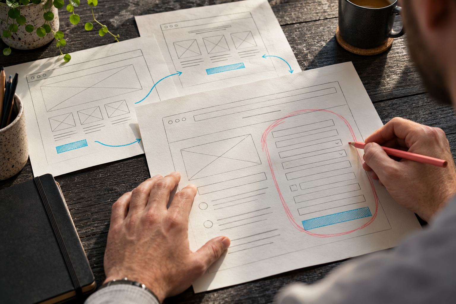
Begin by conducting a thorough audit of your website’s design elements. This includes analysing the layout, colour scheme, typography, and overall visual hierarchy. Look for areas where visitors might encounter friction or confusion. For example, if your call-to-action (CTA) buttons are not prominently displayed, visitors may struggle to find them, leading to missed conversion opportunities.
Consider using tools like heatmaps to visualise user behaviour on your site. Heatmaps can reveal which parts of your pages are getting the most attention and which are being ignored. This data can guide your design decisions, helping you prioritise changes that will have the most significant impact on conversion rates.
Optimise Your Layout for Conversion
Your website’s layout should be designed with conversion in mind. This means creating a clear path for visitors to follow, from the moment they land on your page to the point where they take the desired action. Ensure that your layout is clean and uncluttered, with plenty of white space to draw attention to key elements.
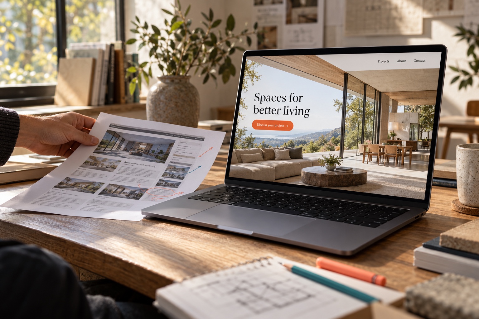
Place your most important CTAs above the fold, where they are immediately visible without requiring visitors to scroll. Use contrasting colours to make these buttons stand out, and ensure the text is clear and compelling. For instance, instead of a generic ‘Submit’ button, use ‘Get Your Free Quote Now’ to create a sense of urgency and value.
Additionally, consider the placement of your forms. If you require visitors to fill out a form to access a valuable resource, make sure it is easily accessible and not hidden behind multiple clicks. Simplify the form fields as much as possible to reduce friction and increase the likelihood of completion.
Leverage Visual Hierarchy
Visual hierarchy is the arrangement of elements on a page in a way that signals their importance to the viewer. By using size, colour, and placement effectively, you can guide visitors’ eyes to the most critical parts of your page. This is particularly important for conversion-focused elements like CTAs and forms.
Use larger fonts and bolder colours for headings and subheadings to make them stand out. This helps visitors quickly understand the main points of your content and encourages them to read further. Similarly, use icons and images strategically to draw attention to key messages and CTAs.
Another effective technique is to use directional cues, such as arrows or lines, to guide visitors’ eyes towards important elements. This can be particularly useful on longer pages where visitors might need help navigating to the most relevant sections.
Implement User-Centric Design Principles
User-centric design focuses on creating experiences that prioritise the needs and behaviours of your audience. This approach can dramatically improve your conversion rates by ensuring that your website is intuitive and easy to use. Start by understanding your target audience’s pain points and motivations. Conduct user interviews or surveys to gather insights into what they value most in a website.
Use this information to inform your design decisions. For example, if your audience values convenience, ensure that your checkout process is streamlined and free from unnecessary steps. If they prioritise security, make sure your site has clear trust signals, such as SSL certificates and customer testimonials.
Finally, test your design changes with real users to gather feedback and make necessary adjustments. Tools like user testing platforms can provide valuable insights into how visitors interact with your site and where they encounter difficulties. Use this data to continuously refine your design and optimise for better conversion rates.
Three Actionable Steps to Improve Your Website’s Design for Conversion
- Conduct a comprehensive design audit to identify areas for improvement.
- Optimise your layout and visual hierarchy to guide visitors towards conversion-focused elements.
- Implement user-centric design principles to create a seamless and intuitive user experience.